OVERVIEW
User Research, Qualitative Research, UX Design
NVivo, Sketch, InVision
May-Aug 2018
London, United Kingdom / Colombo, Sri Lanka
This is my dissertation project, evaluating an Intensive Care Unit (ICU) bed registry system runs by Network for Improving Critical-care Systems and Training (NICST) in Sri Lanka. The system is currently used to assist data validators from NICST on suggesting island-wide ICU bed to clinicians who make bed requests. The aim of the project is to evaluate and extend the acceptability of the system.
PROCESS
#1 BRIEF
Received the brief form the project host, including: current system, background, goal, stakeholders, and deadline.
#2 EVALUATING CURRENT SYSTEM
Gathered requirements from stakeholders in different positions through interviews and observations. A heuristic evaluation was also conducted to understand the usability issues of the current system.
#3 RE-DESIGN AND TESTING
8 rapid design steps: 2 co-design workshops, informal interviews, and cognitive walkthrough. Prototypes were iterated in between.
BACKGROUND
THE ORGANISATION
Network for Improving Critical-care System and Training (NICST)
NICST is a non-profit organisation in Sri Lanka run by international, multidisciplinary professionals and is aimed at improving healthcare service in Sri Lanka, starting from the most critical patients in the setting. Their main office is at the Young Man’s Buddhist Association (YMBA) building in Colombo, the commercial capital of Sri Lanka in Western Province.
THE SYSTEM
National Intensive Care Surveillance (NICS)
NICS is constructed with 2 systems, a bed allocation system and a bed registry system, assisting clinicians to find critical care beds. Bed availability information in the bed allocation system is synchronised with the bed registry system for validators to offer patient transfer suggestions to the clinicians.
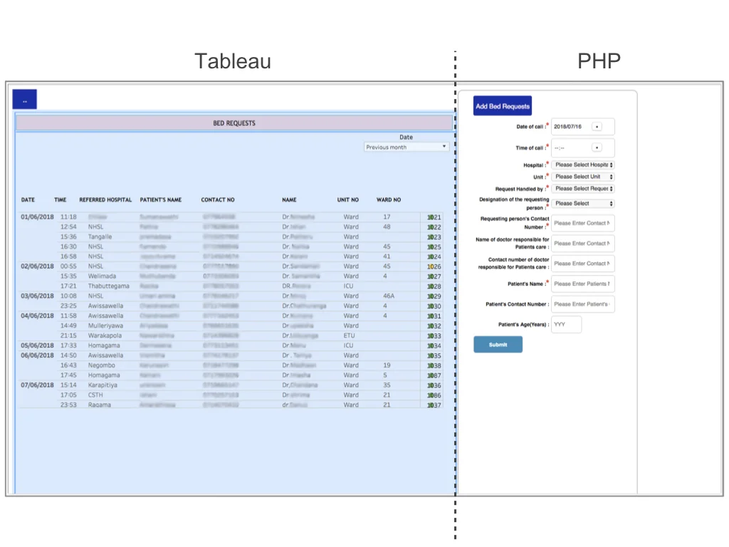
Both systems are website based, with statics information from Tableau on the left, and data entry form on the Hypertext Preprocessor (PHP) system on the right. This project focused on evaluating the ICU Bed Registry System.
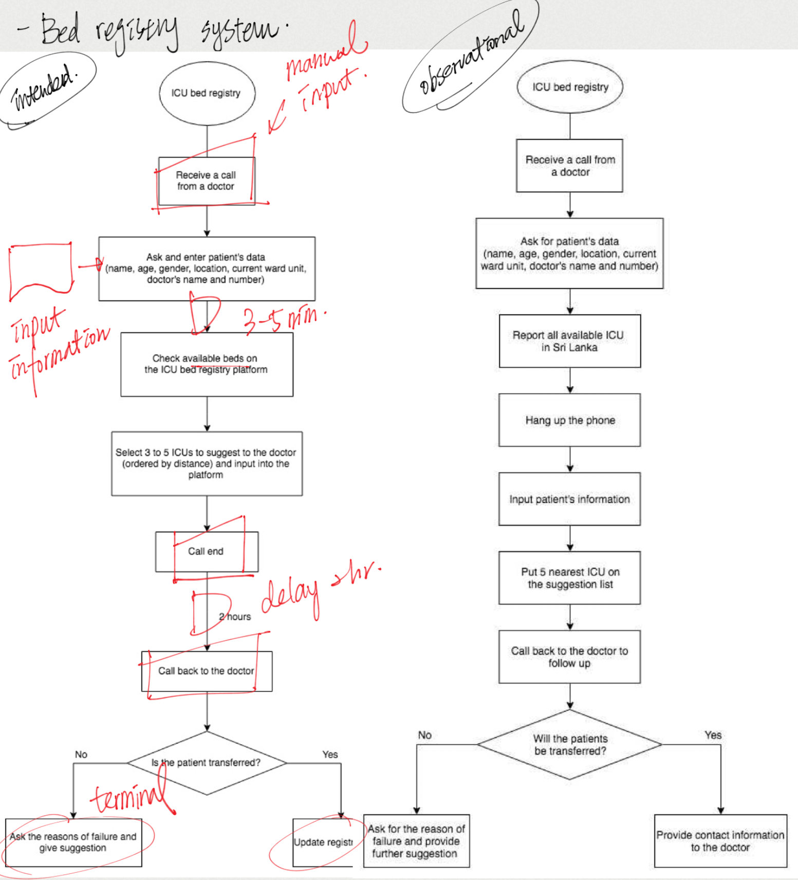
The ICU bed registry system is for validators from NICST to search valid ICU bed options for clinicians who call to request beds for their patients. Bed registry process can be divided into three phases: receiving a request and its requirement, offering options, and follow-up transfer outcome.
RESEARCH
REQUIREMENTS GATHERING AND EVALUATING CURRENT SYSTEM
User research was aimed to, first, gather the requirements of the stakeholders from different perspectives on the ICU bed registry process through observations and interviews, and secondly, uncovered the usability problems of the current systems by doing interviews and a heuristic evaluation. The output was an account of user practices and needs, and a prioritised list of user requirements.
ICU bed registry system intended and observational diagram.
Thematic analysis.
Main findings
1 The system is to assist validators to provide suggestions to the requestors’ request on the phone. However, current design does not support users to operate the system during the phone calls.
2 Distance information was a critical requirements for all the stakeholders which, however, is not on the current ICU bed registry system.
CHALLENGES
Professionals at NICST has built multiple systems to support NICS. However, in spite of the comprehensive healthcare information was included, the usability of the system was comparably weak. During the project, the limitation and challenges occurred were discussed bellow.
Hierarchy in the Workplace
The research was at first on a clinician focused direction, therefore, the initial design of the co-design workshop was to gather participants form different positions, especially doctors and nurses, to discuss design ideas together. However, the researcher was later informed that under the working context of the culture, participants at different position from the hospital would not interact with each other. Therefore, the workshop was then redesigned to separate participants from different positions, gathered their opinions separately.
The hierarchy did not only affect the interaction outside the ward, but moreover, formed the way they worked in the hospital. Doctors and nurses did not have much communication, even of the patient information. Only once or twice a day will the nurses put the patients’ vital sign record into the BHT form where all clinicians and hospital coordinators can read the data. Other records will be kept on paper putting in the nurses’ pocket and that records of each patient may be incoherent or incomplete.
“They’re just entering the data to the ticket at 6 o’clock in the morning, and 2 o’clock at the noon, and after that I think like 4 o’clock at the evening. The data in between that times are only on their paper and they’re keeping them in (their pocket). [...] They’re just staying in the ICU.” (C4)
Another hierarchal issue happened in the interviews. This was not severe but this may also have little impact on the results. That is, the translators in the research were people in the management level at NICST so the interviewees might or might not reveal their true reflections. Stage 1 of the research was about requirements gathering, as a result, the issue might not affect the results. Nevertheless, when reporting usability problems, the validators had more positive feedback, but mentioned more barriers after the researcher dug into the topic several times from different angles. As a result, this could be either the validators were already used to the system and could not think of the flaws, or they were too shy to say it in front of the translator.
Design Principle
Different culture or context will label colours with different meanings. According to the users’ habit, the design principle was somehow different from the principle in the UK. For instance, colour red, yellow and green usually illustrate the status of safety or alert. In the current ICU bed registry system in Sri Lanka, they used these colours to show the completeness of a bed request. This confused the participants evaluating the final design who were expert in HCI but not the target users of the system.
Another significant difference was mentioned by the project host. When designing the visualisation of distance information, the researcher proposed both graphical, such as visualise the location of each ICUs on a map, and informative illustrations. However, the project host suggested that, according to their past experience, Sri Lankan were more used to read informative information instead of graphical illustrations. This research did not evaluate both illustrations due to the time constraints and the final distance information illustration has not been evaluated by the target users, but this should be considered in the future for the interface design in the Sri Lanka setting.
Difficulty on Accessing Stakeholders: the Changing Aims
Before deciding which system in NICS to evaluate, the research was initially aimed to evaluate on a clinician focus. For instance, aimed at engaging more clinicians to update patient information to the ICU allocation system, or improving the ICU bed registry system more on clinician’s perspective. However, in Sri Lanka settings, clinicians were hard to access. Foreigners were mostly not allowed to enter the hospital to meet the nurses, especially to the ward area. Regardless conducting the interview outside the hospital, the clinicians had intensive workloads led to time constraints, accordingly, it was hard to collect requirements from clinicians’ aspects. Current research ended up interviewing one doctor with the aspect form the Ministry of Health without any nurses due to the access difficulty. Nonetheless, the evaluation from the clinician aspects was still worth invest. Even though, according to the project manager, the clinicians will not be using the systems in recent years due to their working habits, with all the efforts, the progress on improving ICU quality can be foreseen.
SOLUTIONS
DESIGNS AND ITERATIONS
Initial prototype designs were designed based on requirements and findings from the research stage. To ensure the design could fit the most common scenario, stakeholders from multiple positions were invited to join different phases of the design process. The whole design was iterated 4 times in this study.
Current ICU bed registry system homepage layout.
Rapid ideation, making adjustment right after each discussion/workshop.
Main changes
1 Support data input while answering phone calls
In the current system, the user had to submit the patient’s basic information in the overview page to view the bed vacancies. However, the user were usually not able to follow up the speed, therefore, they usually search the bed vacancies through another ICU bed system for suggestions, which provides less required information.
Since ICU bed vacancy is the most important information, I changed the system’s flow, putting the bed information to the front page, that users are able to sort the required criteria during the phone call to provide best offers for the requestors. Moreover, the design fit the requirement to separate Tableau on the left side of the system, and PHP system on the right screen.
2 Distance information
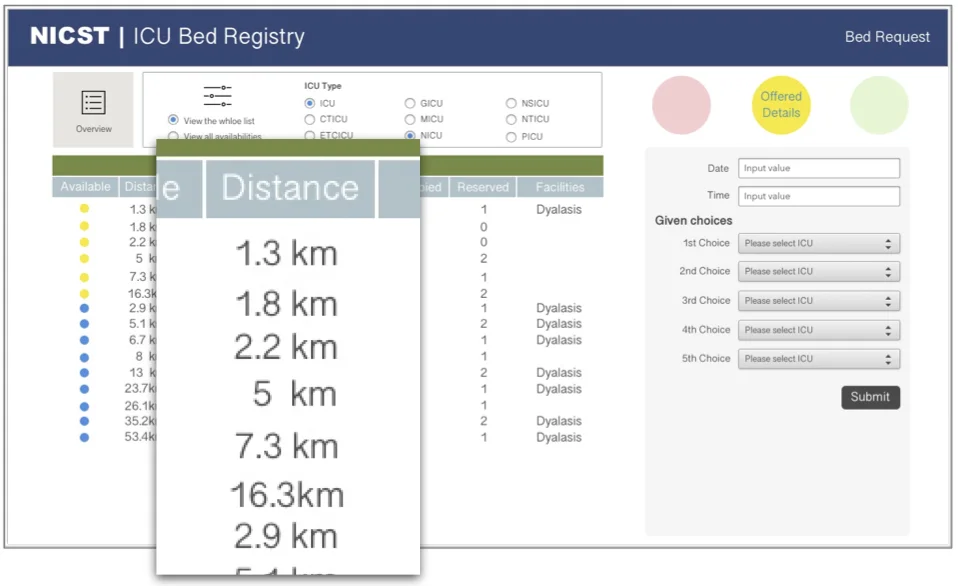
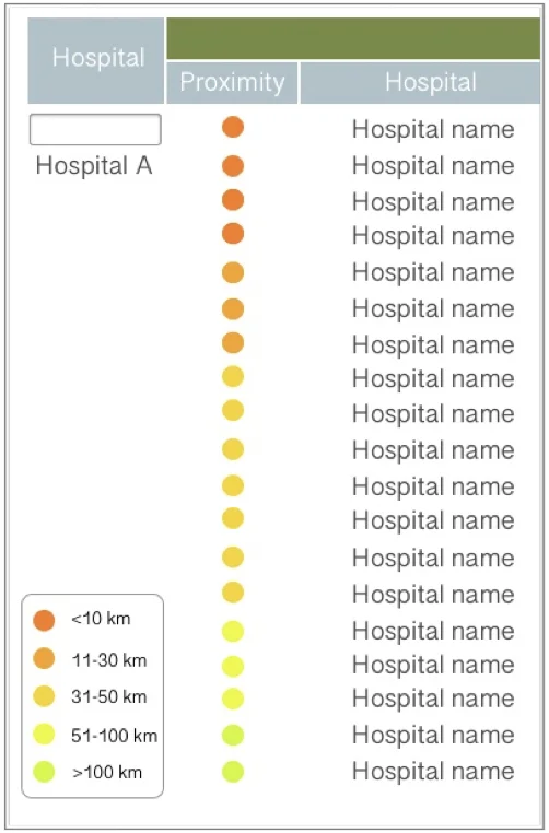
Distance information is the most critical factors on choosing suitable ICU bed for patients in need. The visualisation had been generated as follow. I end up using gradient colours to label the ranges of distance, users will only need to make decisions based on the colour, the darker the closer the hospital is.
#1 Current ICU bed registry system page.
The figure shows the issues and the initial solutions of the current system.
#3 Since it’s hard for the user to imagine the exact distance between hospitals, in the first co-design workshop, participants suggested to put the distance into zones.
#2 The figure shows the first version of the prototype. I kept the ICU availability status label, and put distance in a numeric format. The idea was brought to the first co-design workshop for discussion.
#4 In the final prototype, the distance information was shown in ranges in colours. That is, the users will only need to suggest the darker options.
FINAL PROTOTYPE
The final outcome of this study was a high-fidelity interactive prototype and its evaluation result.
EVALUATION
COGNITIVE WALKTHROUGH
Both analysts were HCI experts familiar with the Sri Lanka settings but not the registry system. Since both of them were first-time users without training, this step of the design iteration was aimed to understand if the usability problems of the current system were improved.
1
The main problem in the final prototype design was the way illustrating the stages in the registry process. Keeping the 3 colour blots demonstrating the stages where the user was at, however, confused HCI experts. Both analysts mentioned that they were either confused about which process they were in on the data entering pages, or they were not sure which of the process they should go next on the overview page.
2
Some tasks and design were context based. That is, for analysts who were not target users of the system, lacking context of the current ICU bed registry system may confused them. The reason is that the evaluation was based on the current system, as a result, some of the designs in the current system were kept. To test the functionality with the non-target user, it would be better to break down the tasks in to smaller mission instead asking them to complete a small part of the registry process.
Most of the designs in the final prototype were clear. The target users who took part of Co-design Workshop 2 had no problem completing the registry process with the prototype. Therefore, more evaluations will be done with target users with the final prototype to understand whether the confusion is due to the contextual effect.


